🎯 Project Overview
Glowbyte is an AI-powered productivity platform designed to help startups and remote teams manage their workflow more efficiently with real-time collaboration, smart task automation, and data-driven insights.
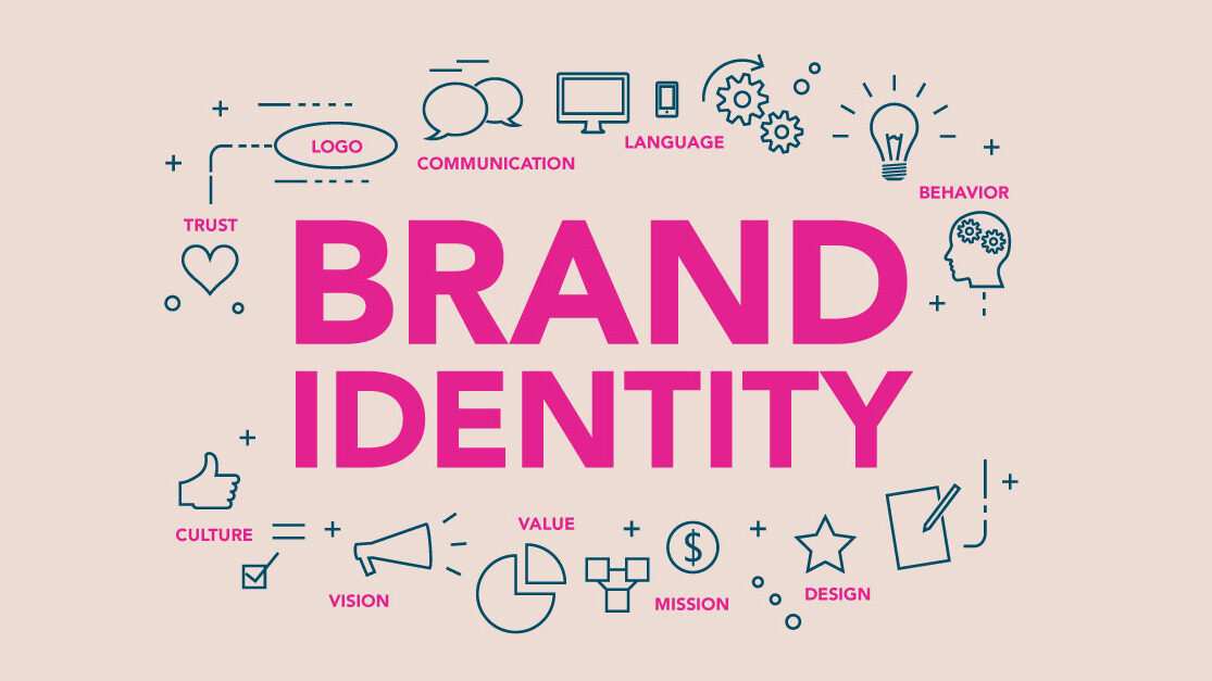
The founders needed a strong brand identity that would appeal to tech-savvy users — something modern, clean, and a little bold — without feeling too cold or corporate.
Our goal: create a brand that feels both futuristic and human, with a strong visual and verbal identity.
✅ Goals & Deliverables
- Design a memorable tech-forward logo
- Develop a sleek color palette and typography system
- Create UI-ready brand components for app and web interfaces
- Build a brand voice that feels confident, helpful, and sharp
- Deliver a full brand style guide for consistency across platforms
🔧 Our Process
🔍 Phase 1: Brand Discovery
- Brand keywords: intelligent, bold, minimal, accessible
- Target audience: startup founders, product managers, agile teams
- Competitive analysis: Trello, Notion, ClickUp, Monday.com
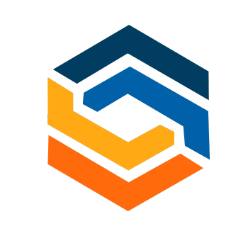
✏️ Phase 2: Logo Design
- Designed multiple concepts using geometric and glowing elements
- Final logo combines a clean wordmark with a glow icon representing “insight” and “connection”
- Designed a monogram ‘G’ variation for the app icon
🎨 Phase 3: Visual Identity
- Color Palette:
- Electric Blue #2D8EFF (primary)
- Midnight Navy #0A0F2C (background)
- Soft Neon Green #C1FF72 (accent)
- Cool Gray #E6E8ED (UI text)
- Typography:
- Heading: Satoshi Variable (bold, techy)
- Body: Inter (clean, versatile)
- Design Elements:
- Glowing gradients for buttons and backgrounds
- Rounded UI elements with glassmorphism highlights
- Modular layout grid for web/app use
🗣️ Phase 4: Brand Voice & Messaging
- Tone: Clear, energetic, empowering
- Sample tagline: “Light up your workflow.”
- Voice principles:
- Speak to builders and doers
- Avoid jargon
- Sound fast, not frantic
📦 Phase 5: Brand Kit Delivery
- Logo variations (primary, icon, dark/light backgrounds)
- Brand colors and usage rules
- Typography hierarchy
- UI iconography starter pack
- App launcher icon
- Editable Figma file + PDF brand guide
📊 Results & Highlights
Although the product hadn’t launched at the time of delivery, the branding system helped Glowbyte:
- Present confidently to early investors and partners
- Speed up UI/UX design with a ready-to-use component library
- Build a cohesive pre-launch marketing kit (social, web, pitch decks)
- Generate buzz via teaser campaigns using their new visual identity
💬 “The brand feels alive — exactly what we needed. It looks premium, but not intimidating. We feel 10x more confident taking Glowbyte public with this identity.”
— Daniel K., Glowbyte Co-founder